Changelog

  1. Landing page and navigation redesign
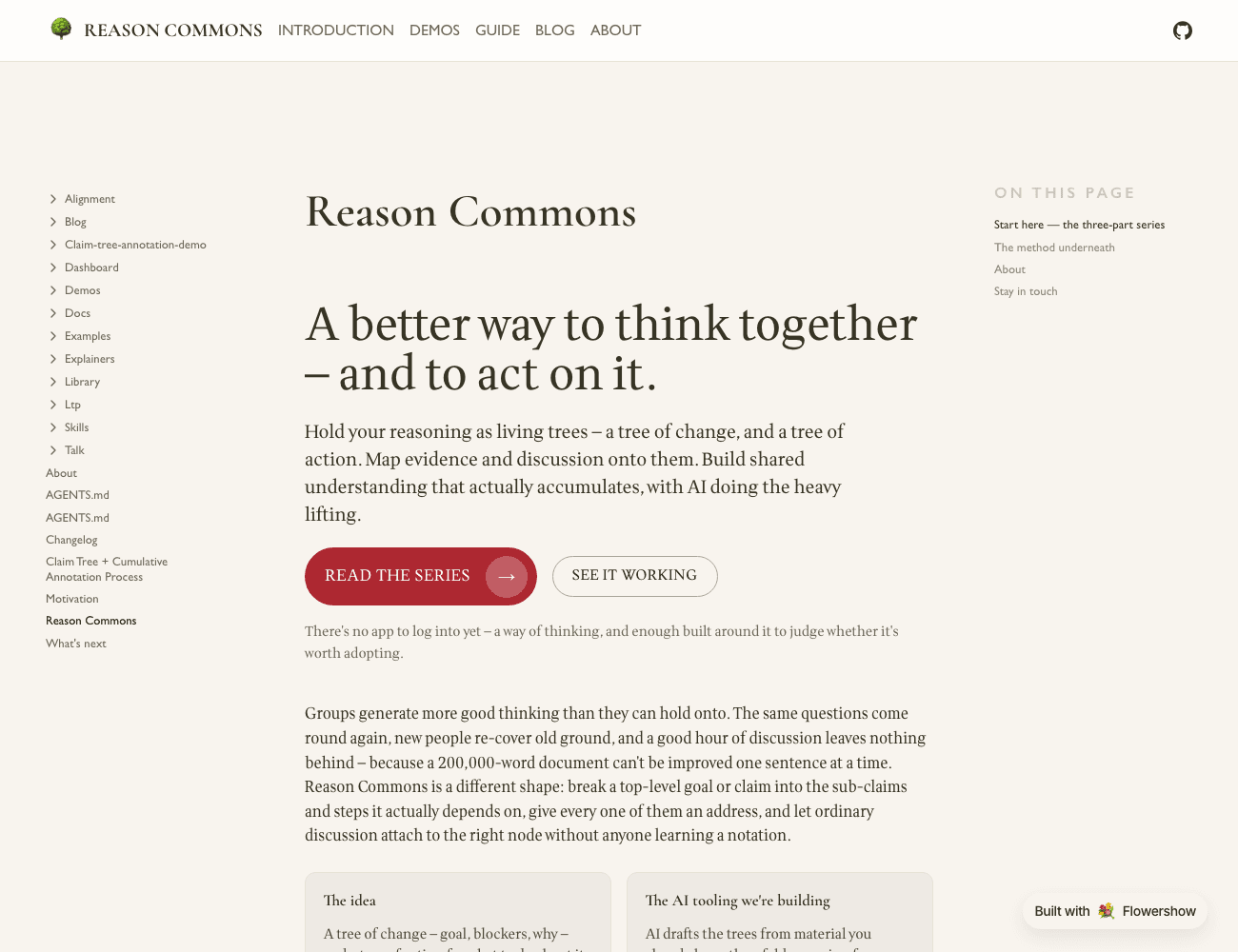
    The redesigned landing page: a large heading "A better way to think together — and to act on it.", a one-line summary, a red "Read the series" button and an outline "See it working" button, then a row of cards — The idea, The AI tooling we're building.

    The front page now leads with what the site actually is — a better way to think together and to act on it: trees of change and trees of action, evidence and discussion mapped onto them, with the AI tooling as the bet — and offers two co-equal ways in, the series and the demo. The prose that used to fill the page moved into an About section below the fold. The nav went from Goal Aligner · The Series · Dashboard · Blog to Introduction · Demos · Guide · Blog · About; Goal Aligner and the other rough pieces are gathered under Demos, and the Logical Thinking Process now has a plain-language Guide in front of its analysis documents. Goal Aligner moved from /alignment/ to /demos/goal-aligner/. Design notes: docs/plans/2026-09-01-site-positioning-and-landing-redesign.md.
  2. Plain versions of two explainers

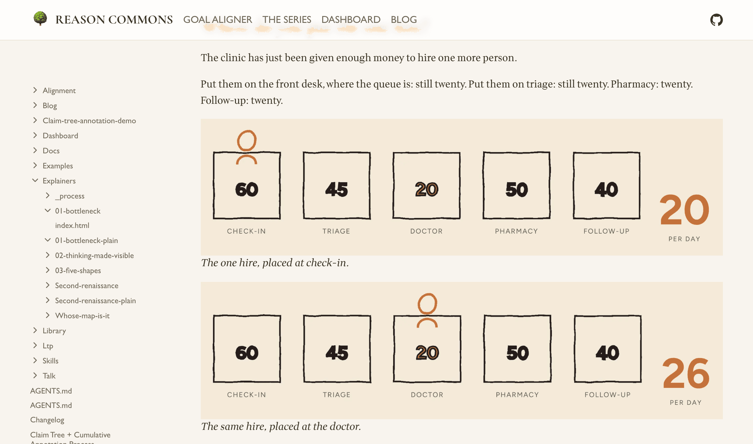
    The "where do you put the one hire?" passage from the plain version of The Wrong Queue: a line of prose, then two static drawings of the five stations with the new hire standing first at check-in (output twenty) and then at the doctor (output twenty-six).

    The Wrong Queue and The Forum Doesn't Remember now each have a plain, non-scrolling companion: the same prose as a classic illustrated essay, with the drawings held still — and the passages that were animations shown as two or three stills side by side. Nothing to scroll-trigger, no JavaScript. They exist to be usability-tested against the scroll-driven originals, which are unchanged; both are linked from the series index.

    The landing page also had a pass — one primary "read the series" call instead of four equal buttons, the "Project LTP" wording dropped from the visitor-facing copy, and the dashboard build-and-serve instructions moved out to docs/dashboard.md.

  3. Mobile fixes to The Forum Doesn't Remember

    A beat-by-beat browser sweep of The Forum Doesn't Remember, and Doesn't Cumulate (formerly Somewhere to Put It) turned up four collisions. Three were phone-only: the "rooted in an actual place" cards in the two timeline stages sat on top of one another, and the "is necessary for" label on the goal-tree stage ran off the right edge. The fourth was on the desktop layout — a caption grew over the diagram at middling widths — and was fixed by tightening the prose rather than moving it. The superseded story/ draft that this piece replaced has also been removed from the repo.

  4. A way in to every explainer

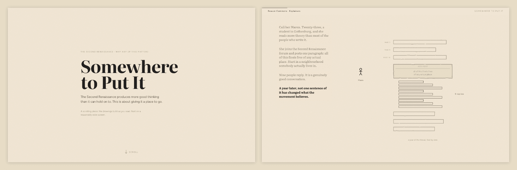
    Left, the title screen that now opens Somewhere to Put It, with a scroll cue at the foot. Right, Maren's story stacked down the left of the drawing, four blocks in order with the live one bright.

    All five scrolling explainers now open on a landing — a title, a scroll cue and a thin bar back to the rest of the site — instead of dropping the reader inside a pinned drawing with no headline and no sign that the page moves. They also respond faster: the second beat of a section used to take a screen and a half of scrolling and now arrives in under half a screen. In Somewhere to Put It, Maren's story stacks down the left of the drawing rather than each beat wiping out the last — or start at The Wrong Queue, which is the way into the series.

  5. A talk that performs the method

    A presentation deck at talk/index.html, built so the audience experiences the Logical Thinking Process before hearing its name. Five acts, each opening on an audience-facing question rather than an artefact: why good conversations go nowhere, what better would look like, the conflict in the way, what changes if it dissolves, and what to do next. The LTP names are withheld until the fifth act, where a ledger maps each act back to the tree that produced it and the deck becomes evidence for its own argument.

    An unlabelled five-node spine advances act by act in the corner, so the room registers structure without being told what it is; on the reveal slide the same spine fills in with current reality, goal, conflict, future reality, next steps. The visual system carries the act-three tension directly — loose italic conversation at the edges, a hairline reasoning graph drawing itself, one amber node for whatever was newly contributed.

    Single self-contained file, fixed 1920x1080 stage that letterboxes rather than reflowing, arrow-key and swipe navigation, #n deep links, and inline text editing behind the E key.

  6. The explainer trilogy, finished

    Five Shapes read on a phone: the obstacles and what gets past each one, stacked and legible

    Drove all three explainers in a real browser and fixed what only shows up there — captions sitting on top of the very thing they were pointing at, boxes falling off the edge of their own drawing, a chain of arrows that read as a tangle. Parts two and three now have portrait layouts to match part one, so the diagrams are readable on a phone instead of shrinking to a ribbon, and the series finally uses the real Organic colours and Figtree rather than a palette that was merely close.

  7. Somewhere to Put It

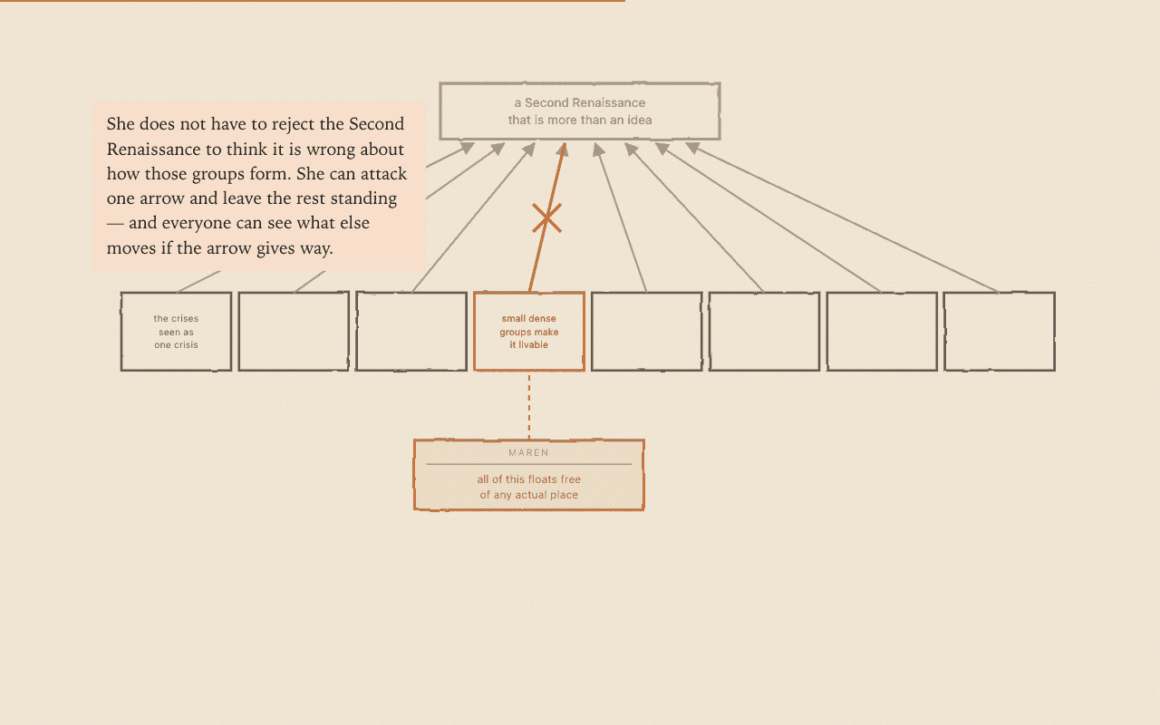
    The map of the eight conditions, with one contributor's objection attached to a single condition and the arrow above it struck through

    A fourth scrolling explainer, and the first that applies the method to a real problem rather than an invented clinic. Somebody posts the best paragraph they have written in a year to the Second Renaissance forum, nine people reply, and a year later nothing they said has changed what the project believes — not for want of intelligence or goodwill, but because there is nowhere to put a good thought. The piece is the case for giving every claim in the project's strategy an address, and for letting a machine do the filing so that contributing costs one sentence rather than five diagrams. It is a sibling to the trilogy, not a part four — someone handed only this link, with no series behind them, still gets a complete read. Every diagram comes from the group's actual five trees.

    An earlier version of this piece, Whose Map Is It, retold a single internal argument about the word "throughput". It was replaced as the way in — it assumed a reader already inside the trees — but it goes somewhere the accessible version deliberately does not, so it now stands on its own at explainers/whose-map-is-it/ as the deeper cut, linked from the series index and from Somewhere to Put It.

    All four explainers also had their running text reset — larger, at the size of the annotations inside the drawings rather than a size below them, and in Literata, so prose and graphics read as one voice and the page looks the same on every machine instead of picking a different serif on each.

  8. Repo gardening

    Rebranded to Reason Commons, turned the README into a real landing page, and tidied the explainers folder and docs — no new content, but the site now reads as a finished project rather than a workspace. Also fixed the diagrams in The Wrong Queue, which had been rendering as raw markup instead of pictures.

  9. Explainer trilogy: drafted, built, and shipped in two formats

    Three-part LTP explainer series in explainers/, replacing the earlier single story/ piece as the project's introductory narrative. Each piece went through a script pass (draft → self-critique → independent fresh-agent critique with no authorship context → revision), then a visual build.

    • Added skills/scrollable-explainer/ — general-purpose write-up of the scroll-driven ("scrollytelling") explainer form, with a full measured teardown of a ProPublica piece as the worked case study.
    • Wrote and built three pieces: The Wrong Queue (01-bottleneck), The Arrows Nobody Checks (02-thinking-made-visible), Five Shapes (03-five-shapes).
    • Each part now ships in two forms from the same finalized prose:
      • article.md — static markdown with inline SVG figures, no <script> (matches the story/draft.md convention)
      • index.html — scroll-driven animated version, via shared explainers/scroller.js / scroller.css
    • explainers/index.html lists both formats per part.
    • Mobile portrait layout for piece 1's five-station diagram (pieces 2–3 still pending).
    • explainers/NEXT.md — checkpoint with open questions and a prioritized follow-up list. Tracked in issue #6.

    Known gaps: pieces 2–3 need the same mobile pass as piece 1; piece 3's HTML page renders empty with JavaScript disabled; the scroller uses an ad hoc palette rather than the real Organic design tokens; story/'s fate is undecided.

Built with LogoFlowershow